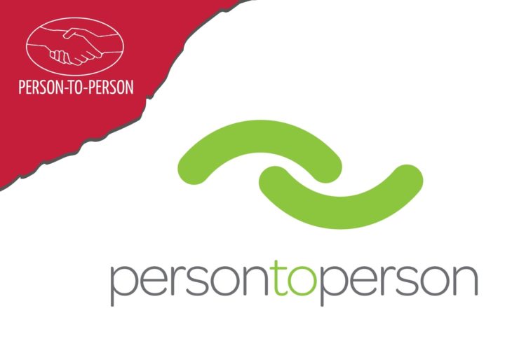
Welcome to the new look of Person to Person (P2P).
We hope that you love it as much as we do.
As we emerge from the pandemic, our team decided it was the right time to implement a fresh, inclusive, welcoming, and optimistic update to P2P. While it was not easy to move away from the red color and hands logo that served us well over the past 50 years, it was time.
The shape of the new logo is two arcs, meant to give the impression of giving and receiving. The two arcs being the same size reflects that we are all the same, but in differing circumstances. The arcs may also represent arms embracing in a hug, two hands reaching for each other, and a frown turning into a smile.
The light green color represents optimism, new growth, and the grassroots and community aspects of P2P.
The new logo and color was developed by Karl Maruyama, a wonderful, local graphic designer, with guidance from the P2P staff and Board of Directors. After working with the P2P team and observing our mission in action, the designer was so moved, he graciously donated his services.
Please be patient as we transition all our signage, vehicles, collateral, and branding to reflect our new look.
To speak with a member of our team about our refreshed look or how you can get involved, email info@p2pHelps.org or call 203-655-0048. Thank you.
